
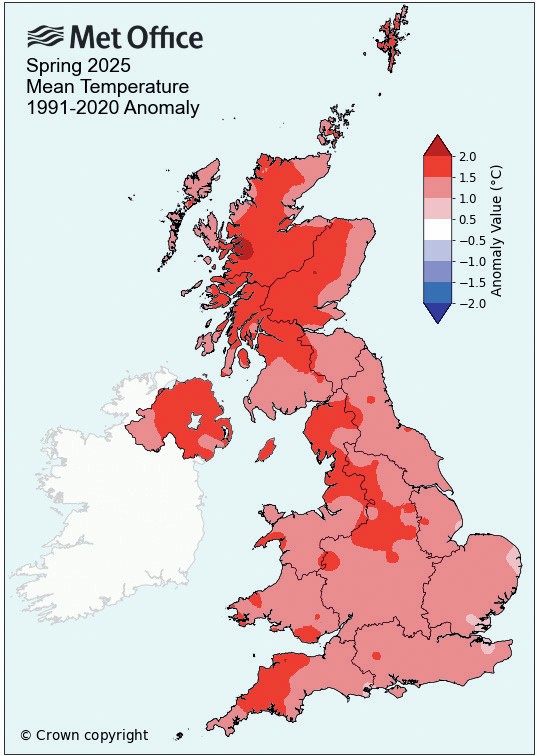
The Met Office defines spring as the months of March, April and May. Figure 1 shows how the mean average spring temperatures in the UK in 2025 differed from the long-term average temperatures. The word ‘anomaly’ is used to show the difference. The long-term average temperatures are calculated by taking the average from 1991 to 2020.
Where Figure 1 is shaded in reds and pinks, it shows areas where the average temperature in spring 2025 was higher than the average temperature of the past 30 years. You can clearly see that the UK had temperatures at least 1°C above the long-term average. The darker the colour, the higher the temperature difference and so it’s clear that many areas were even warmer. Looking at Scotland, we can see a few areas that were 2°C higher than the long-term average (shown with the dark red shading).
Your organisation does not have access to this article.
Sign up today to give your students the edge they need to achieve their best grades with subject expertise
Subscribe